Bar & Picture Graphs in Early Elementary School [Book Review]
By: Kristin Hunter-Thomson
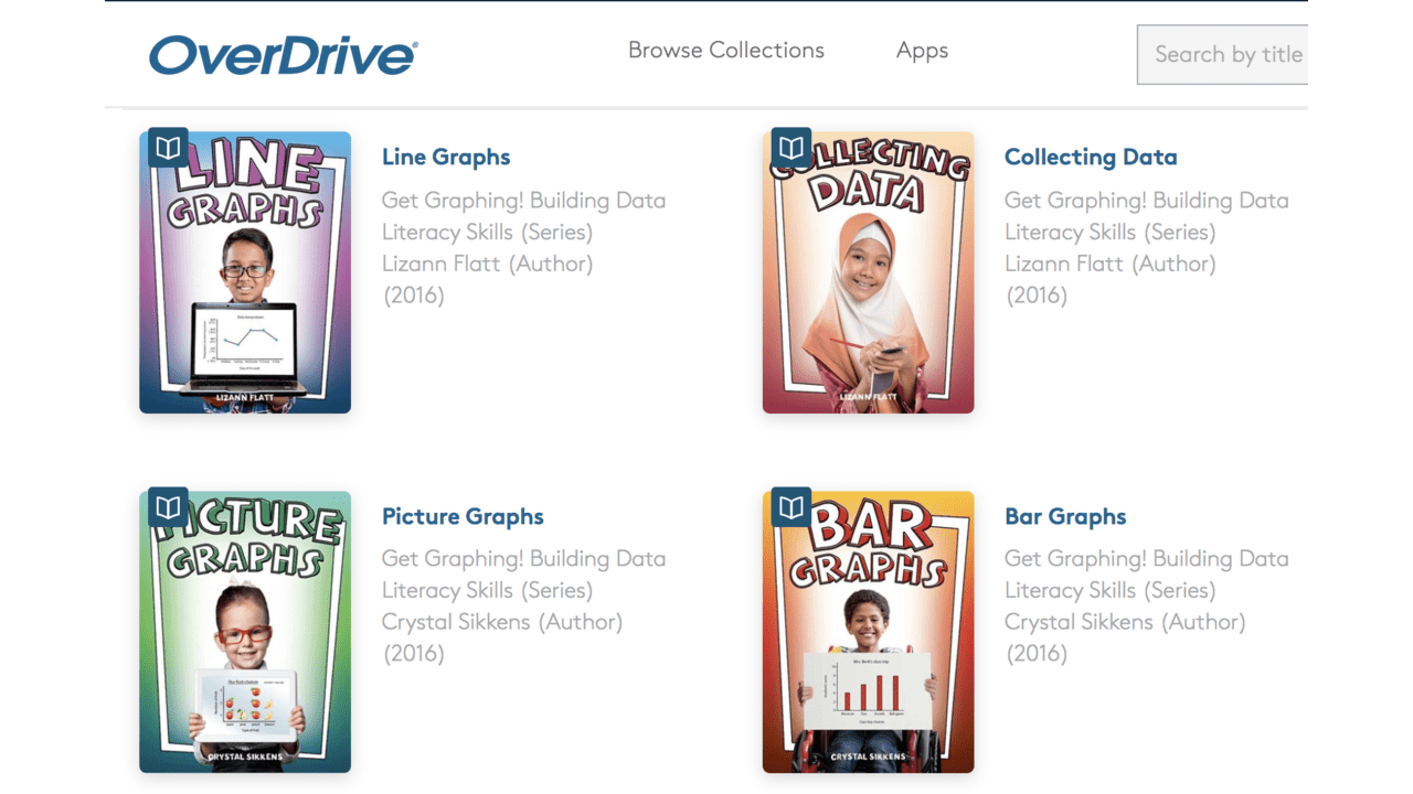
https://www.overdrive.com/series/get-graphing-building-data-literacy-skills
Hello early elementary school educators!
Looking for some helpful ways to think about making graphs? Check out Crystal Sikkens’ “Get Graphing! Build Data Literacy” series. The pages are fun to read and look at by you and your students. Each book starts with an overview of what data are and a discussion about different kinds of graphs. She then breaks down what the different parts of the graph type are and provides real-world examples of when you could use that graph type with your data and questions.
I have not read all in the series, but can provide the following comments as it relates to the Picture Graphs and Bar Graphs books.
Picture Graphs (aka pictographs) are an excellent graph type to help younger students visualize the frequency that each category was observed/counted. Pictographs are a great way to help students compare the number of observations (or frequency) across categories (which is similar to a frequency bar graph but with pictures). Interwoven throughout the Picture Graphs book are fun activities for students to practice reading and/or making their own pictographs.
Bar Graphs are used for many purposes: frequency of observations by category, observed value by category, sum of values by category, or mean value by category (*if this is new, reach out and we can dive into the differences together). The Data Detectives and other activities for students to practice making frequency bar graphs are interspersed throughout the Bar Graphs book.
A small note, when just one attribute is being displayed it is better to use one color, rather than vary the color of each bar for each category. This is not a big deal in early ES and I think students at this stage should do whatever is easiest for them in making and reading the graphs. The tricky thing is that as more attributes are added to a bar graph we often use color difference to make that easier to compare the bars across the two attributes by the categories...so if the color varies by categories as well that gets to be a lot to think about and make sense of.
Remember, what you include in your title on a graph (regardless of what graph type you are using) is dependent on whether you are helping a reader get familiar with the data (as discussed in these books) OR if you are communicating a message from the data. For more on graph titles check out our blog post Let's Talk Titles!
By sure to check these and the rest in the series out as great resources for younger students diving confidently into making and reading graphs. If you do, let us know what you think. Enjoy graphing!
